
How to Build a Social Media Style Guide
August 30, 2026 · 5 min read · by Jan Oršula
A social media style guide is the short document that settles, in advance, how a brand sounds and looks on social, so anyone writing a post makes the same choices the brand would, without asking. Build it around six fillable parts: an accounts inventory, three to five voice traits each paired with a this-not-that example, hashtag rules, emoji rules, visual and format specs, and response protocols. This guide gives you that structure and, because most people reading this run several brands at once, frames it as a "style guide lite" you can complete per client. It sits upstream of every caption you write: the doc that makes caption writing consistent instead of a fresh guess each time. (This is the human reference doc, distinct from conditioning an AI on a brand's voice, which is a separate exercise.)
Why the guide has to exist before the captions
Consistency isn't a personality trait a team has; it's a decision that was made once and written down. When it isn't, every post reopens the same questions (formal or casual, emoji or none, one hashtag or ten) and different people answer differently on different days. The account drifts. A style guide's whole value is removing those questions from the per-post moment: the writer isn't deciding how the brand sounds, they're applying a decision already made. That's also what makes a new hire, a freelancer, or a covering teammate able to post on-brand in week one instead of month three.
For agencies the stakes multiply. You're not keeping one voice consistent, you're keeping five or ten distinct voices from bleeding into each other. The SaaS client's dry precision and the skincare client's warm chatter can't come out sounding like the same person had a slightly different day. A short guide per client is what keeps each account in its own lane, and it pairs with the client profiles where you already store each brand's details so the voice reference lives next to the accounts it governs.
The six parts (fill each one in)
1. Accounts inventory
List every channel this guide covers: platform, handle, who it's for, and a one-line note on how the voice or format flexes there. LinkedIn and TikTok for the same brand shouldn't read identically, and this is where you say how they differ: "LinkedIn: same voice, one notch more measured; TikTok: faster, more slang." It's also the reference a new teammate uses to find the right accounts on day one.
2. Three to five voice traits, each with a this-not-that
This is the core, and vague adjectives are where most guides die. "Friendly, professional, authentic" tells a writer nothing they can act on. Pick three to five traits and make each one operational with a paired example:
Warm, not saccharine. This: "Rough week? This one's for you." Not this: "Sending you all the positive vibes and endless love, friends 💕💕"
Confident, not corporate. This: "We rebuilt the export tool. It's faster now." Not this: "We are thrilled to announce enhancements to our export functionality."
Playful, not try-hard. This: "New drop. You know the one." Not this: "OMG you guys this is literally everything, we can't even 😭😭😭"
The "not this" line does the real work. It draws the boundary a plain adjective can't. A writer who sees the pair knows exactly where the brand stops.
Voice stays, tone shifts
Your voice is the set of traits above, and it shouldn't change from post to post. Your tone is how strongly each trait comes through in a given moment, and it should change: the same brand sounds different announcing a launch and apologizing for an outage. Add a short tone map so writers don't have to guess:
| Situation | Tone | Example |
|---|---|---|
| Launch or new product | Playful turned up | "New drop. You know the one." |
| How-to or education | Confident and clear | "Three steps, two minutes. Here's how to reset it." |
| Celebrating a customer | Warm turned up | "This made our week. Mind if we share it?" |
| Reply to a complaint | Warm and plain, no jokes | "That's not the experience we want. I've sent you a DM to sort it today." |
| Outage or bad news | Serious, no emoji | "Checkout was down for two hours this morning. It's fixed, and failed orders have been refunded." |
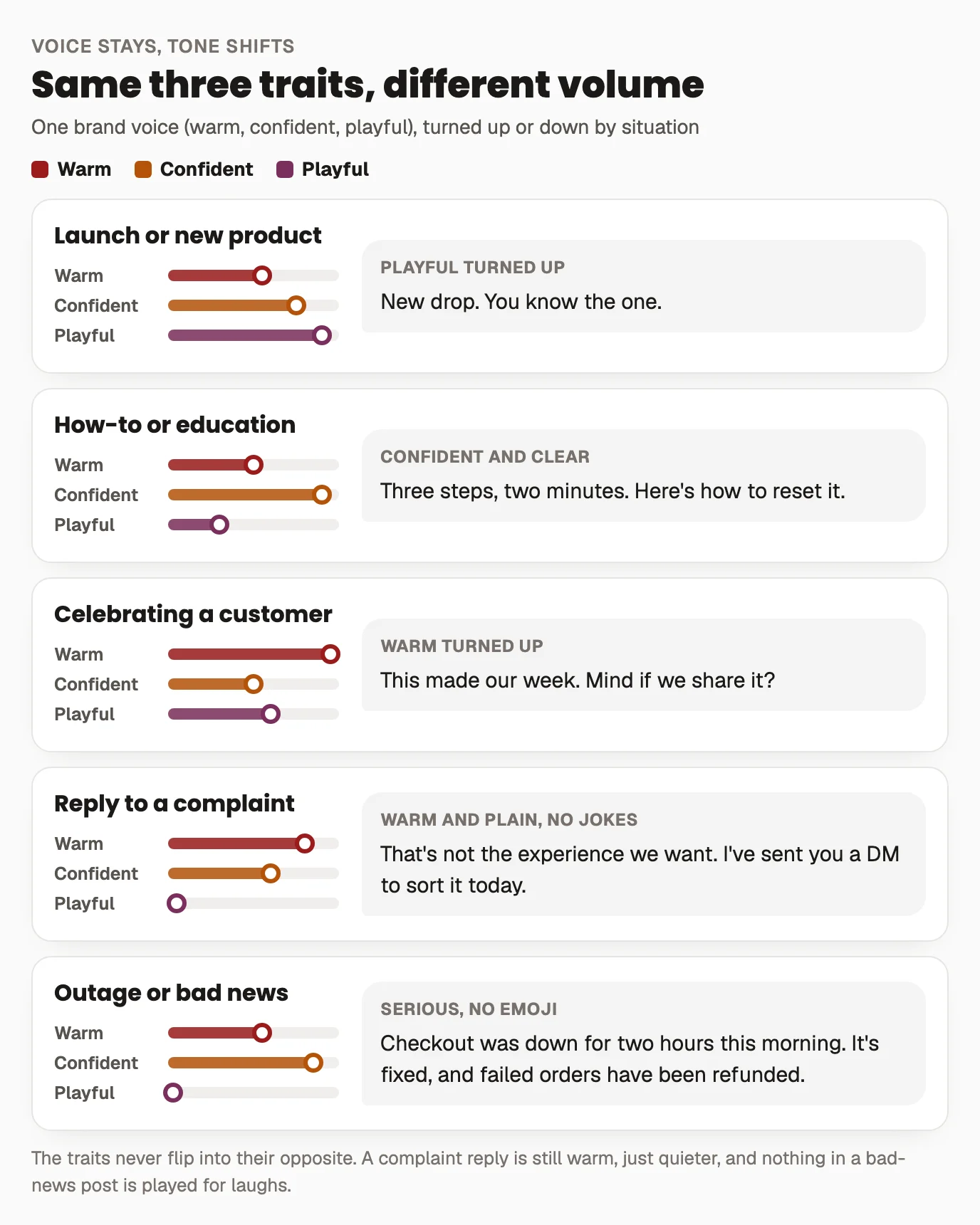
The traits never flip into their opposite. A complaint reply is still warm, just quieter. If a situation needs a voice the brand doesn't have, that's a sign it should come from a person, not the brand account.
3. Hashtag rules
Decide and record: how many hashtags per post (and whether it varies by platform), your set of branded/campaign tags, whether tags go in the caption or the first comment, and any capitalization convention (#SocialMedia reads more accessibly than #socialmedia to a screen reader). Nailing this stops the account swinging between a bare caption one day and thirty tags the next.
4. Emoji rules
State the posture plainly (none, sparing, or liberal) and give a couple of examples of on-brand use. Note any emoji that are off-limits for tone or that clash with the brand, and flag the accessibility point: screen readers announce every emoji aloud, and a caption with an emoji between each word becomes exhausting to hear, so keep them at natural breaks rather than as decoration.
5. Visual and format specs
The look, made checkable: color hex codes, the fonts used in graphics, logo usage, image treatment (bright and airy vs. moody), whether you caption videos, alt-text expectations, and the text-formatting stance: do you use bold/italic unicode or line-break tricks, and where. If formatting is part of the brand, our guide to formatting social text covers doing it without wrecking accessibility. Spelling this out is what keeps twelve posts looking like one brand instead of twelve.
6. Response protocols
The guide shouldn't only govern posts, because most brand interactions happen in replies and DMs. Set the voice for comments and messages (usually a touch warmer and more human than posts), the response-time target, how to handle complaints and the tricky ones, and what gets escalated to the client versus handled in-house. This is also where you note the line between routine replies and a crisis-level situation that needs a different chain.
Make it a filled-in doc, not a beautiful unread one
A style guide only works if people open it, so optimize for reference, not admiration. Keep it to a couple of pages per brand. Lead with the voice traits and this-not-that examples, since that's what a writer checks most. Store it where the work happens, not in a folder nobody visits: beside the client profile and the calendar. And treat it as part of onboarding: a good client onboarding should produce enough raw material (sample posts they love, words they'd never use, the founder's voice) to fill this guide in the first week, before you've posted anything on their behalf.
Then keep it alive. When a post overperforms or a client says "that's exactly us," fold the reason into the guide; when something feels off-brand, add the "not this" line that would have caught it. A style guide that grows with the account is the difference between a team that sounds like one brand and one that sounds like whoever happened to be posting.
Frequently asked questions
What should a social media style guide include?
Six parts: an accounts inventory (each channel and how voice flexes there), three to five voice traits each with a this-not-that example, hashtag rules (count, branded tags, placement, capitalization), emoji rules (posture plus off-limits cases), visual and format specs (colors, fonts, alt text, formatting stance), and response protocols for comments and DMs. Keep it to a couple of pages so people actually use it.
What's the difference between brand voice and tone of voice?
Voice is the brand's consistent personality, the three to five traits that stay the same everywhere. Tone is how strongly those traits come through in a particular moment. A launch post and a reply to a complaint should share a voice but differ in tone: playful turned up for one, warm and plain for the other.
How do I define brand voice in a style guide?
Skip the vague adjectives and make each trait operational. Pick three to five traits and pair every one with a this-not-that example: a line that's on-brand and a line that's close but wrong. Warm, not saccharine, with a real sentence under each, tells a writer where the brand stops in a way that friendly and authentic never can.
How is a style guide different from training AI in a brand voice?
A style guide is a human reference document people read and apply when they write. Training an AI on a brand voice conditions a model to generate in that voice. They can share source material, but they're separate tools: the guide keeps a team consistent and onboards new writers, and it stays useful even for work no AI touches.
Do agencies need a separate style guide for each client?
Yes. The whole point for an agency is keeping distinct client voices from blending, so each brand needs its own short guide, its own voice traits, and its own this-not-that examples. A style-guide-lite per client, stored next to that client's profile, is what keeps a SaaS account and a skincare account from sounding like the same writer on different days.