
Open Graph Images: The Link Preview That Earns Clicks
October 1, 2026 · 5 min read · by Jan Oršula
An Open Graph image is the picture that unfurls when someone shares your link, the card with a headline and thumbnail that appears in a tweet, a LinkedIn post, a Slack message, or an iMessage. It's set by a single line of code (og:image) on the page, and its size is 1200×630 pixels, a 1.91:1 ratio that fits nearly every platform's preview. That card is a thumbnail for a link, and it does real work: a sharp one with a readable headline pulls clicks, while a missing or blurry one makes your link look broken and kills shares. This guide covers the size, what makes an OG image earn the click, how platforms differ, and how to set it.
What an Open Graph image actually is
Open Graph is a small set of meta tags a page puts in its HTML to tell other sites how to display it when the link is shared. The Open Graph protocol defines the tags (title, description, image, and a few more), and every major platform reads them to build a link preview. The og:image tag points to the picture, and that picture becomes the visual of the card.
The key mental shift: this image isn't decoration on your page, it's the advertisement for your link out in the feed. Someone scrolling a timeline sees the card before they see your site. It competes for a tap against everything else on screen, and it has one job: make the link look worth clicking. Treat it like a thumbnail, because functionally that's exactly what it is.
The size: 1200×630, and why
Make the image 1200×630 pixels at a 1.91:1 aspect ratio. That single size renders cleanly across Facebook, LinkedIn, Slack, Discord, WhatsApp, iMessage, and X's large card, so one well-made image covers almost every place a link gets shared. Save it as JPG or PNG and keep the file reasonably small (under ~1MB loads faster and survives the platforms' recompression better; there's a hard ceiling around 8MB but you never want to be near it).
Two sizing traps to avoid:
- Going too small. An image under about 600×315 gets downgraded to a tiny thumbnail beside the text instead of the big edge-to-edge card, which is far less clickable. 1200×630 guarantees the large format.
- Ignoring the safe zone. Different platforms crop the edges slightly. Keep your headline, logo, and any faces inside the centre, with roughly 60–80px of padding on every side, so nothing important gets clipped. Backgrounds can run to the edge; meaning shouldn't.
For the full set of dimensions across in-feed images, stories, and profile assets, the social media image sizes guide is the companion reference; this page is specifically about the share-preview card.
What makes an OG image earn the click
Size gets the card to render. Design gets the tap. The OG images that pull clicks share a few traits, and most of them come down to being legible at thumbnail scale after compression:
- A readable headline baked into the image. Don't rely on the platform to show your
og:titletext. Bake the core promise into the picture itself in large, bold type. On a phone the card is small, and a headline the reader can parse in one glance does more than any stock photo. - High contrast, heavy fonts. Platforms recompress your image, and compression eats thin fonts, subtle gradients, and low-contrast text. What looks elegant in your design tool can turn to mud in the feed. Bold weights and strong contrast survive it.
- Consistent brand. A recognisable colour, logo placement, or template makes your links identifiable in a feed and builds familiarity across shares. It also signals the link is legit rather than spam.
- One idea. The card is too small for a busy composition. One headline, one focal point, breathing room. A cluttered OG image reads as noise and gets scrolled past.
The test: shrink your design to the size of a feed thumbnail and glance at it for one second. If you can't read the headline and tell whose it is, neither can the person deciding whether to click.
How platforms unfurl differently
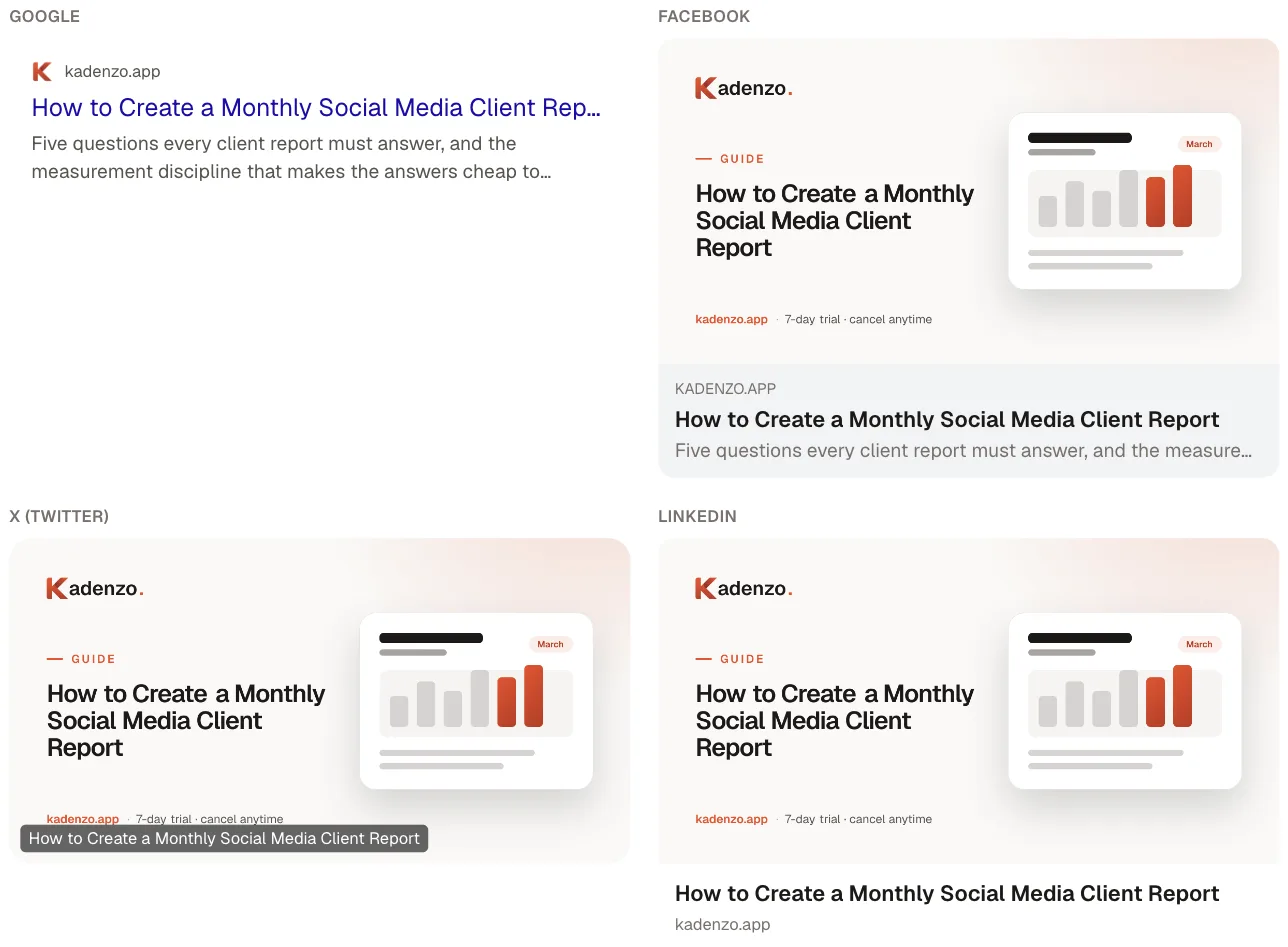
"Unfurl" is the term for a platform turning a bare link into a preview card. They mostly read the same Open Graph tags, but present them differently:
- X (Twitter) uses a Summary Card with Large Image for a 1200×630
og:image, showing the picture big with the title below. Get the image below the size threshold and it collapses to a small side thumbnail instead. - LinkedIn shows a prominent card and caches it aggressively. Once it has fetched your preview, it holds onto the old version, which is why a fixed image sometimes keeps showing the stale one.
- Facebook renders the large card and, like LinkedIn, caches. Both offer a debug/inspector tool to force a re-scrape when you've updated the image.
- Slack, Discord, WhatsApp, iMessage all build previews from the same tags, so the 1200×630 image serves them without extra work.
The practical upshot: one correctly-sized og:image covers all of them, but caching means changes don't always show up instantly. You often have to prompt the platform to re-fetch.
Setting og:image (and why a missing one costs you)
The mechanism is one meta tag in the page's <head>:
<meta property="og:image" content="https://yoursite.com/preview.jpg" />
<meta property="og:image:width" content="1200" />
<meta property="og:image:height" content="630" />
Use an absolute URL (the full https://… path, not a relative one) or platforms can't fetch it, and include the width and height tags so crawlers know the dimensions before they render. Pair it with og:title and og:description for a complete card.
When the tag is missing, wrong, or points at a broken file, the platform falls back to whatever it can scrape, often a random image from the page, a tiny logo, or nothing. A link with no preview looks untrustworthy and gets shared far less. Since the share card is frequently the first thing an audience sees of your link, a blank or blurry one quietly caps how much traffic the link can earn. That's the connection to everything downstream: the OG image is the top of the funnel for driving traffic from social media, and for link-in-bio destinations where a single link does a lot of work, a strong preview is what turns a share into a visit.
Two tools make this concrete. The OG image generator builds the 1200×630 card (headline, brand, safe-zone-aware layout) from your own text and images, so you're not fighting a design app to hit the ratio. Then the link previewer shows how your link actually unfurls across platforms before you post it, catching a missing tag, a wrong crop, or a cached old image while you can still fix it.
The short version
The OG image is a thumbnail-sized advertisement for your link. Make it 1200×630, bake a readable headline into it in bold high-contrast type, keep the important parts in the centre safe zone, and set it with an absolute og:image URL plus width and height. Then preview the unfurl before you share, because a missing or blurry card makes even a great link look like one worth skipping.
Frequently asked questions
What size should an Open Graph image be?
1200×630 pixels at a 1.91:1 aspect ratio. That size renders as the large card across Facebook, LinkedIn, X, Slack, Discord, WhatsApp and iMessage, so one image covers nearly every place a link is shared. Save it as JPG or PNG, keep the file under about 1MB so it survives platform recompression, and keep headlines and logos inside a centre safe zone with roughly 60 to 80 pixels of padding.
What is the difference between an OG image and a regular image?
A regular image lives on your page for visitors who are already there. An Open Graph image is the preview card that appears out in the feed when someone shares your link, before anyone visits. It's set by the og:image meta tag and acts as the advertisement for the link. Because it competes for a tap at thumbnail size, it needs a readable baked-in headline and high contrast, not just a nice photo.
How do I set an Open Graph image?
Add a meta tag in the page head: meta property og:image with the content set to the full absolute URL of your image, plus og:image:width and og:image:height tags so crawlers know the dimensions. Use an absolute https URL, not a relative path, or platforms can't fetch it, and pair it with og:title and og:description for a complete card. Then re-scrape on platforms that cache, like LinkedIn and Facebook.
Why isn't my link preview showing the right image?
Usually caching or a fetch problem. LinkedIn and Facebook cache previews aggressively, so after you change the image they keep showing the old one until you force a re-scrape in their debug tool. Other causes are a relative rather than absolute image URL, a file that's too large or too small, or a missing og:image tag altogether, which makes the platform fall back to a random or blank preview.
Do all platforms use the same Open Graph image?
Mostly yes. Facebook, LinkedIn, X, Slack, Discord, WhatsApp and iMessage all read the same Open Graph tags, so a single 1200×630 image serves them. They present it a little differently, mainly whether it's a large card or a small side thumbnail, and a too-small image can collapse to the thumbnail on some. Previewing the unfurl per platform before posting catches those differences.