
How to Write Alt Text (That Actually Helps)
September 30, 2026 · 5 min read · by Jan Oršula
Good alt text describes what's in an image and the point it's making, in plain language, with the meaning front-loaded. It's the text a screen reader speaks aloud when someone can't see the picture, so "sunset over a city skyline, orange light on glass towers" helps, while "IMG_4821" or a blank field tells a listener nothing. Skip "image of" and "photo of" (the screen reader already says it's an image), lead with what matters, and stop when you've conveyed the meaning. This guide covers what to include, what to leave out, where to add alt text on each platform with its limits, and how to handle charts, decorative images, and screenshots.
What alt text is actually for
Alt text stands in for the image when the image can't be seen, whether by someone using a screen reader or when a picture fails to load. Its job is to deliver the same information and intent the sighted viewer gets, not to catalogue every pixel. That distinction is the whole craft: a photo of your team at an award show isn't "five people standing on a stage," it's "our team accepting the 2026 industry award on stage", because the award is the point of the post, and the description that drops it fails the listener.
So before you write, ask what this image is doing in the post. Is it proof, a punchline, a product shot, a mood? Describe the content, then make sure the reason it's there survives into the text. Everything below is in service of that.
What to include, what to skip
A reliable shape for most images is subject + action + the detail that carries the meaning, front-loaded so the important part lands first even if a listener moves on early.
Include:
- The main subject and what it's doing.
- Any text baked into the image: a quote card, a stat overlay, a meme caption. If words are part of the graphic, they belong in the alt text verbatim, or the listener misses the actual message.
- The detail that makes the image relevant to the post (the award, the product colour, the facial expression that sets the tone).
Skip:
- "Image of" / "photo of" / "graphic showing". Screen readers already announce that it's an image, so these just waste the opening words.
- Keyword stuffing. Alt text is an accessibility feature, not a place to cram hashtags or repeated phrases; it makes the listen worse and fools no one.
- Detail that doesn't serve the point. Describing the exact shade of every background object buries the meaning under noise.
Good vs bad, side by side:
- Bad:
photo of a woman with a laptop. Good:A social media manager reviewing a content calendar on her laptop, the week's posts mapped out in colour-coded rows - Bad:
chart. Good:Bar chart: engagement rate rose from 1.2% in January to 3.8% in June across all platforms - Bad:
quote graphic. Good:Quote card reading: Consistency beats intensity. Post twice a week for a year, not daily for a month
The good versions aren't longer for the sake of it; they carry the information the bad ones drop.
Where to add it, and the platform limits
Every major platform has a native alt-text field. Use it rather than dumping a description into the visible caption, where it clutters the post for everyone and often isn't read as alt text by assistive tech.
- Instagram: Advanced settings → "Write alt text" before posting, or edit an existing post's alt text later. Practical limit around 100 characters, so be economical.
- X (Twitter): "Add description" on each image at compose time. Generous limit, up to about 1,000 characters, but you can't edit it after posting, so get it right first.
- LinkedIn: "Add alt text" appears when you attach an image. Around 120 characters.
- Facebook: override the auto-generated alt text with your own when you upload; keep it concise, roughly a sentence or two.
- Pinterest: an alt-text field on each Pin, up to around 500 characters, useful for the more descriptive images Pinterest favours.
One caveat cuts across all of them: some screen readers stop reading after roughly 125 characters. So even where the field allows more, front-load the meaning in the first sentence and treat the rest as supporting detail. If the essential information only appears at character 400, a listener may never reach it.
Decorative images, charts, and screenshots
Not every image needs the same treatment.
- Decorative images (a divider, a background texture, a purely aesthetic flourish that adds no information) should get empty alt text (an intentionally blank field, or
alt=""on the web) so the screen reader skips them instead of announcing "image" for nothing. Most social platforms don't expose a true-null option, so keep the description to a word or two rather than inventing meaning that isn't there. - Charts, graphs, and infographics carry data, and data needs words. Don't write "bar chart". State the takeaway and the key numbers: what's being compared, the trend, the standout figure. If the graphic is genuinely dense, put the short version in alt text and the full breakdown in the caption where everyone benefits.
- Screenshots hide their content from anyone who can't see them. A screenshot of a tweet, a review, or a DM needs the text of what's shown transcribed in the alt text, plus who said it, or the whole reason you posted it is lost.
The rule underneath all three: describe as much as the image's role requires, and no more.
Make it a habit, not an afterthought
Alt text works when it's part of drafting the post, not a box ticked at the end. The fastest way to build the habit is to write the alt line while you're writing the caption, since you already know what the image is for at that moment. The two are covered together in the caption writing guide, and alt text sits inside the wider set of practices in the social media accessibility guide, alongside readable formatting and emoji discipline.
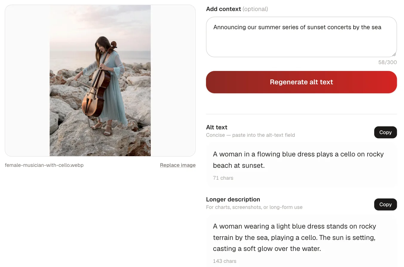
When you're staring at an image and the words won't come, the alt-text generator takes your own uploaded image and drafts a description you can tighten: front-load the meaning, add the text that's baked into the graphic, and trim it to the platform's limit. It pairs with the AI caption writer so the alt line and the caption get written in the same pass rather than one being remembered later. For the exact field locations and formatting, the platforms' own help centres, such as Instagram's accessibility documentation, stay the most current reference.
The short version
Describe the content and the point, lead with the meaning, drop "image of," and never let baked-in text or a chart's takeaway go missing. Add it in each platform's native field, front-load the first sentence because listeners may not hear the rest, leave truly decorative images blank, and write the alt line while you write the caption so it's never an afterthought.
Frequently asked questions
What should alt text include?
The main subject, what it's doing, and the detail that makes the image relevant to the post, front-loaded so the meaning lands first. If the image contains text, like a quote card or a stat overlay, include that text verbatim, because a listener otherwise misses the actual message. Describe the point the image is making, not just its surface contents.
Should I write image of or photo of in alt text?
No. Screen readers already announce that the element is an image, so starting with image of or photo of just wastes the opening words a listener hears first. Lead straight into the subject: instead of photo of a woman with a laptop, write a social media manager reviewing her content calendar. Spend the character budget on meaning, not on labelling the format.
What is the character limit for alt text on each platform?
Roughly: Instagram around 100 characters, LinkedIn around 120, Facebook a concise sentence or two, Pinterest up to about 500, and X up to about 1,000, though X can't be edited after posting. Regardless of the limit, some screen readers stop reading near 125 characters, so put the essential information in the first sentence and treat the rest as supporting detail.
Do decorative images need alt text?
No. Purely decorative images like dividers, background textures, or aesthetic flourishes should get empty alt text so a screen reader skips them instead of announcing image for nothing. On the web that's alt equals an empty string. Most social platforms don't offer a true-null option, so keep the description to a word or two rather than inventing meaning the image doesn't carry.
How do I write alt text for a chart or screenshot?
For a chart, state the takeaway and the key numbers rather than writing chart (what's compared, the trend, the standout figure), and put a fuller breakdown in the caption if the graphic is dense. For a screenshot, transcribe the text that's shown plus who said it, since the content is otherwise invisible to anyone using a screen reader. Describe as much as the image's role requires.